Brand Strategy · Research · Hydration ·
Up & Run.
Research and strategy for a children's hydration supplement. F3inding the insight that reframed a supplement as fuel for the way kids already live.
01 — The Brief
An established brand. A completely new audience.
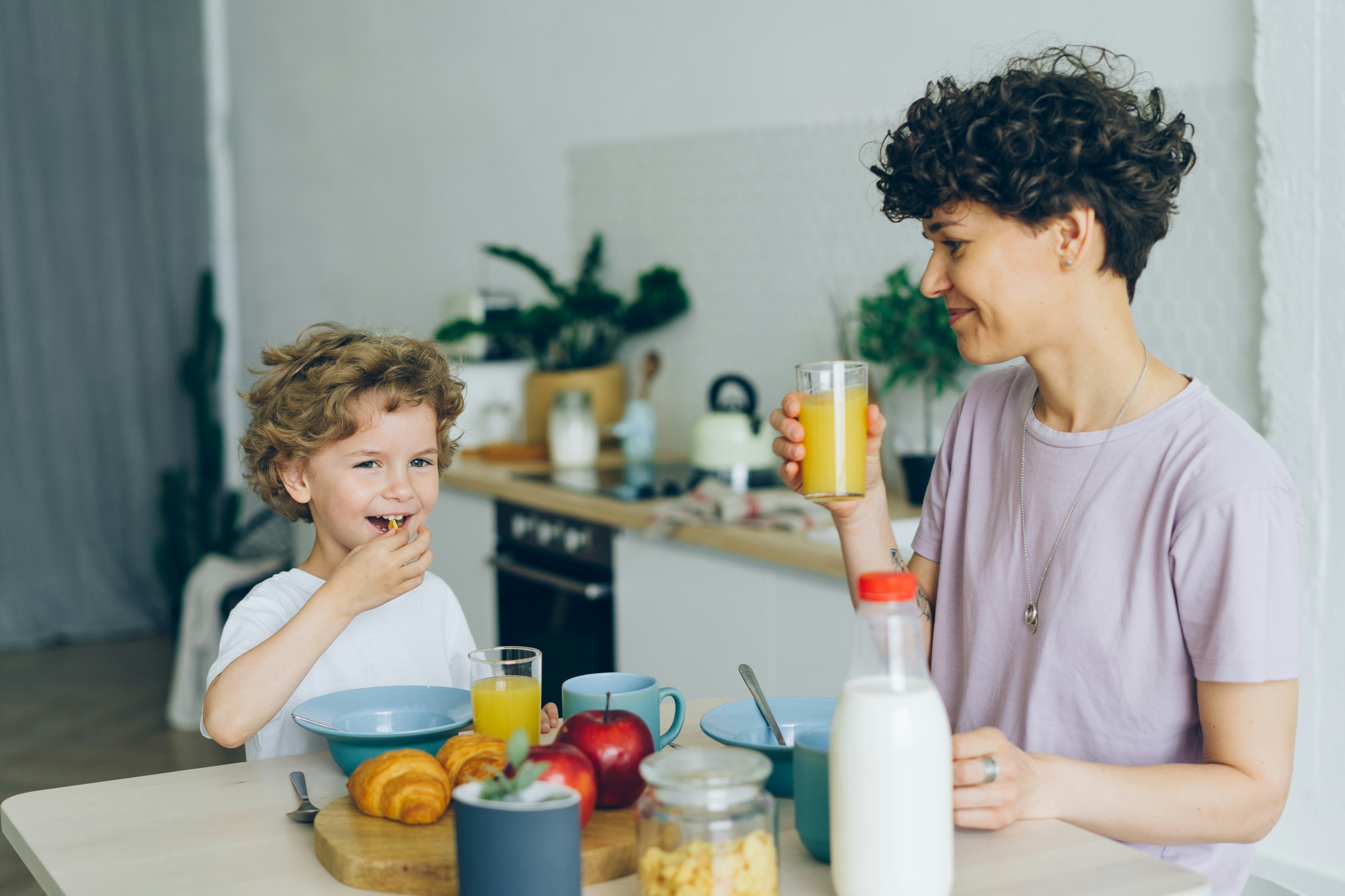
Up & Run had built a credible hydration brand for active adults — gym goers, athletes, everyday movers. Now they wanted to extend into a new and very different audience: children aged 3–14.
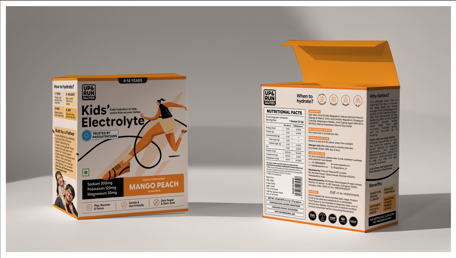
The product was a clean, need-based hydration supplement designed to support kids through their days. The brief was to find the central idea that communication could be built on, something that worked for the new product while staying true to what Up & Run already stood for.
02 — The Problem
The supplement perception problem goes deeper than most brands acknowledge.
Parents are comfortable with what they know — Horlicks, Bournvita, sugary drinks, milk. These aren't necessarily good choices nutritionally, but they're familiar. They don't feel like interventions. They feel like food.
Supplements carry a different association — something medicinal, something that implies the child is lacking. That perception doesn't disappear with better packaging or cleaner ingredient lists. It has to be reframed entirely.
Tension one
Supplements feel medicinal. Parents associate them with deficiency, not daily life. The product needed to feel like fuel, not a fix.
Tension two
Parents were problem aware but solution unaware. They knew something was off — afternoon fatigue, post-sport exhaustion — but hadn't connected it to hydration specifically.
03 — The Research
Designed to map what parents were actually thinking.
I designed a qualitative research questionnaire built around four areas: what parents noticed about their children's energy through the day, what they were currently giving them and why, what their associations with supplements were, and what would make them trust a new product in this space.
What came back was consistent. Parents weren't thinking about hydration at all. They were thinking about energy and solving it with familiar, sugar-heavy products because the alternatives felt clinical or unnecessary.
I also mapped how global and domestic competitors were approaching children's packaging — Cure Hydration, Welle Kids, Hiya, Liquid IV. A consistent pattern emerged: most brands spoke to parents through clinical and functional language while trying to attract children through colour and character. Very few were doing both well. Nobody in India was doing it at all.
“No brands in the kids hydration space in India. That was the opening.”
04 — The Insight
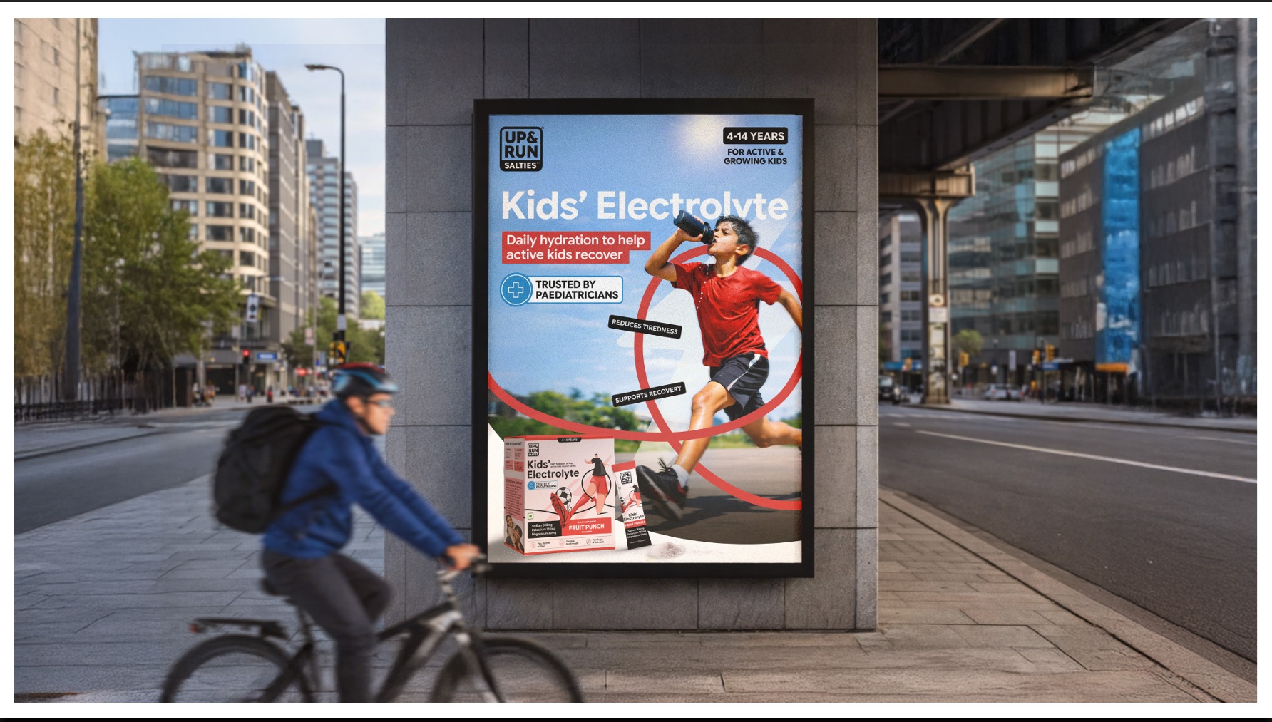
Kids don't need to be fixed. They're already moving.
Almost every brand in the children's supplement category speaks to a deficit. Your child lacks immunity. Your child lacks nutrition. Your child lacks focus. The communication is built around what's missing.
But that's not how children experience themselves. Children don't think about what they lack. They think about what they're doing next. School. Sports. Running around. The next thing.
Children are already the most active demographic there is. They have more on their plates than most adults. More movement, more energy expenditure, more heat exposure, more physical output. The hydration they need isn't corrective. It's fuel. This reframe changed everything.
“The product wasn't a supplement that filled a gap. It was hydration that kept up with kids who never slow down.”
05 — The Singular Idea
Movement is the proof of life. It is how we grow, adapt, and feel alive. For Up & Run, movement became the thread that connected the adult product and the children's product without forcing either into an uncomfortable fit.
Athletes move to perform. Adults move to keep pace. Kids move because that's just what kids do. One idea. Three audiences. One brand.
06 — Brand Architecture
A system built to serve two audiences simultaneously.
Brand Philosophy
Movement is the proof of life — it is how we grow, adapt, and feel alive. The inward-facing belief that every product decision flows from.
Brand Anchor
We support every kind of movement, through everyday hydration. The outward-facing promise that works for athletes, adults, and children alike.
Brand Values
Simplicity. Integrity. Functionality. Empathy. Community. Resilience. Each value serves the person behind the product — not the product itself.
Brand Personality
The Hero (capability, progress, confidence) balanced by The Explorer (freedom, curiosity, everyday adventure). One says you can. The other says go find out.
The dual archetype served the dual audience. The Hero spoke to parents; your child is capable, and this supports that capability. The Explorer spoke to children; the world is yours to run through, and this keeps you running. Both archetypes served the same product but met their respective audiences exactly where they were.
07 — Positioning
Where Up & Run lives in the mind.
“For active individuals who refuse to slow down, Up & Run is a hydration brand with clean, need-based formulations that help your body stay hydrated, so you can keep moving.”
The positioning centres on behaviour, not demographics. “Active individuals who refuse to slow down” describes a mindset that applies equally to a parent watching their child sprint through a school sports day and to the child doing the sprinting. That elasticity is what makes the idea work across the full brand architecture.
08 — Communication Pillars
Five territories. One consistent idea.
Need-Based Hydration
Product territory
We highlight what makes each product unique; the function, the benefit, the flavour, and the specific need it solves. Clear, simple, purposeful. Hydration built for your needs, not the other way round.
Movement & Everyday Hydration
Philosophy territory
At the core of Up & Run is movement; physical, mental, emotional. We build hydration that keeps people going through their every day, across age and intensity.
Everyday Support & Encouragement
Emotion territory
We speak to the human behind the hustle, warmly and honestly. Encouraging people to listen to their bodies, take breaks, drink up, and keep going.
Simple Hydration Science
Education territory
We simplify the science. Making it easy to understand what's in your mix, why it matters, and how to use it. ORS was made for emergencies. We're made for every day.
Real Movement Stories
Community territory
Stories from the movers, thinkers, parents, and kids who show how hydration fits into real life. Everyone here is pushing for something. That's what we have in common.
09 — Tone of Voice
How the brand sounds.
Bold, clear, encouraging, human. The confidence of the Hero with the openness of the Explorer — never overhyped, never preachy, always in service of the person moving.
Hydration that keeps you moving.
Brand essence → tagline. Movement made simple.
What this project shows
Up & Run taught me something specific about entering a new audience with an existing brand. The temptation is always to build something entirely new to speak to a new audience. But the more honest and often more powerful move is to find the thread that already exists in the brand and follow it somewhere new.
Up & Run was already about movement. Children are already movers. The insight wasn't invented. It was recognised. That's the work I find most interesting: not building a brand idea from nothing, but finding the one that was already there, waiting to be seen.
Next Project
Richbear
A brand strategy for a multi-city café chain entering a market where coffee has been commoditised.